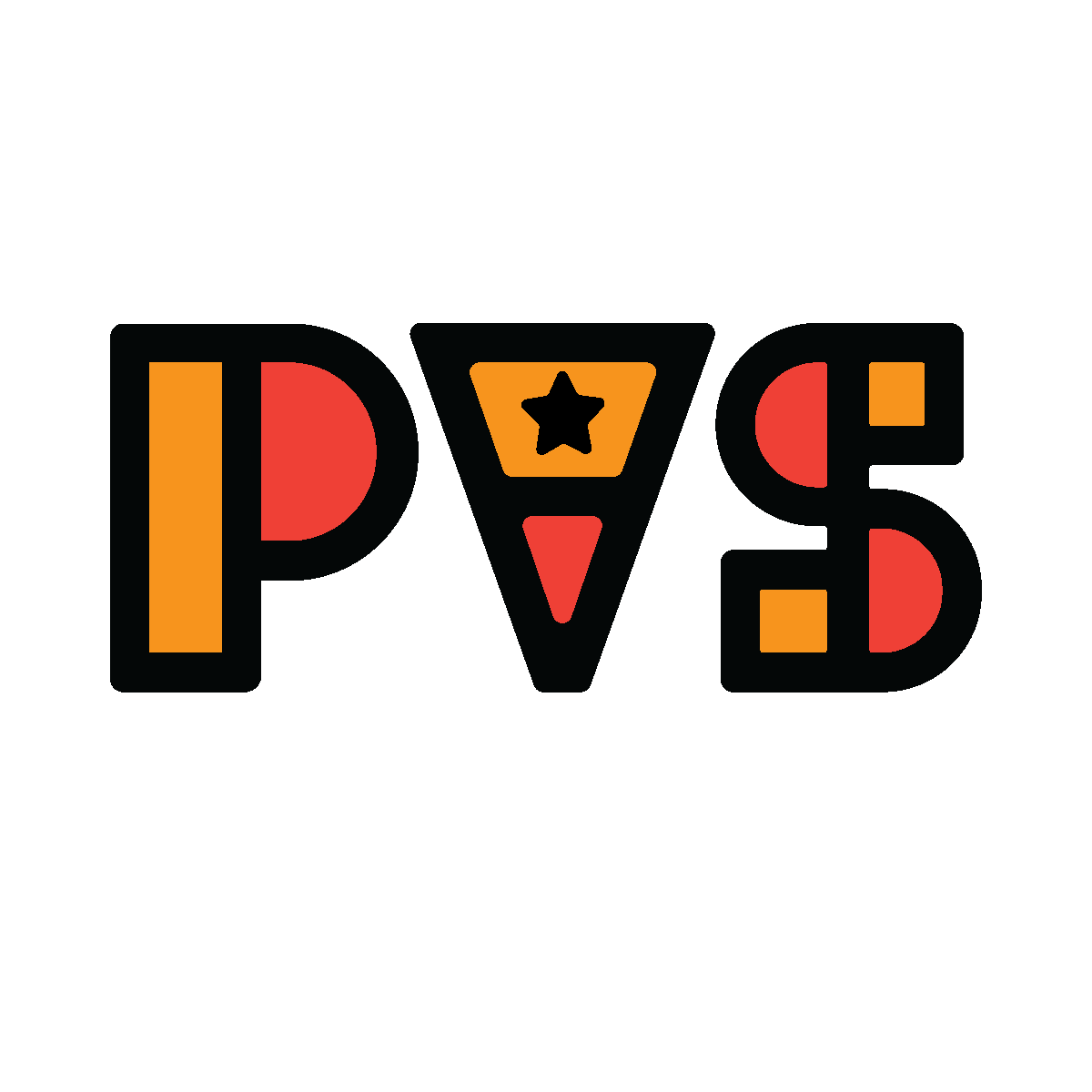
Original Monogram Logo project for Digital Illustration I
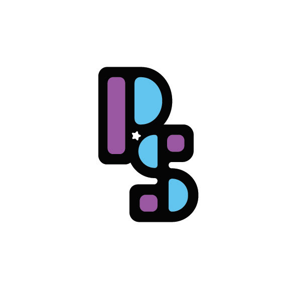
Reworked Monogram Logo
I played around with rounding out the outline shapes, changing the color palette, and removing the “V”. I don’t use my middle name or initial for anything, so I simplified the design by taking it out completely. Here is the new version, which I actually feel represents me even better!

Original Landscape and Character project from Digital Illustration I
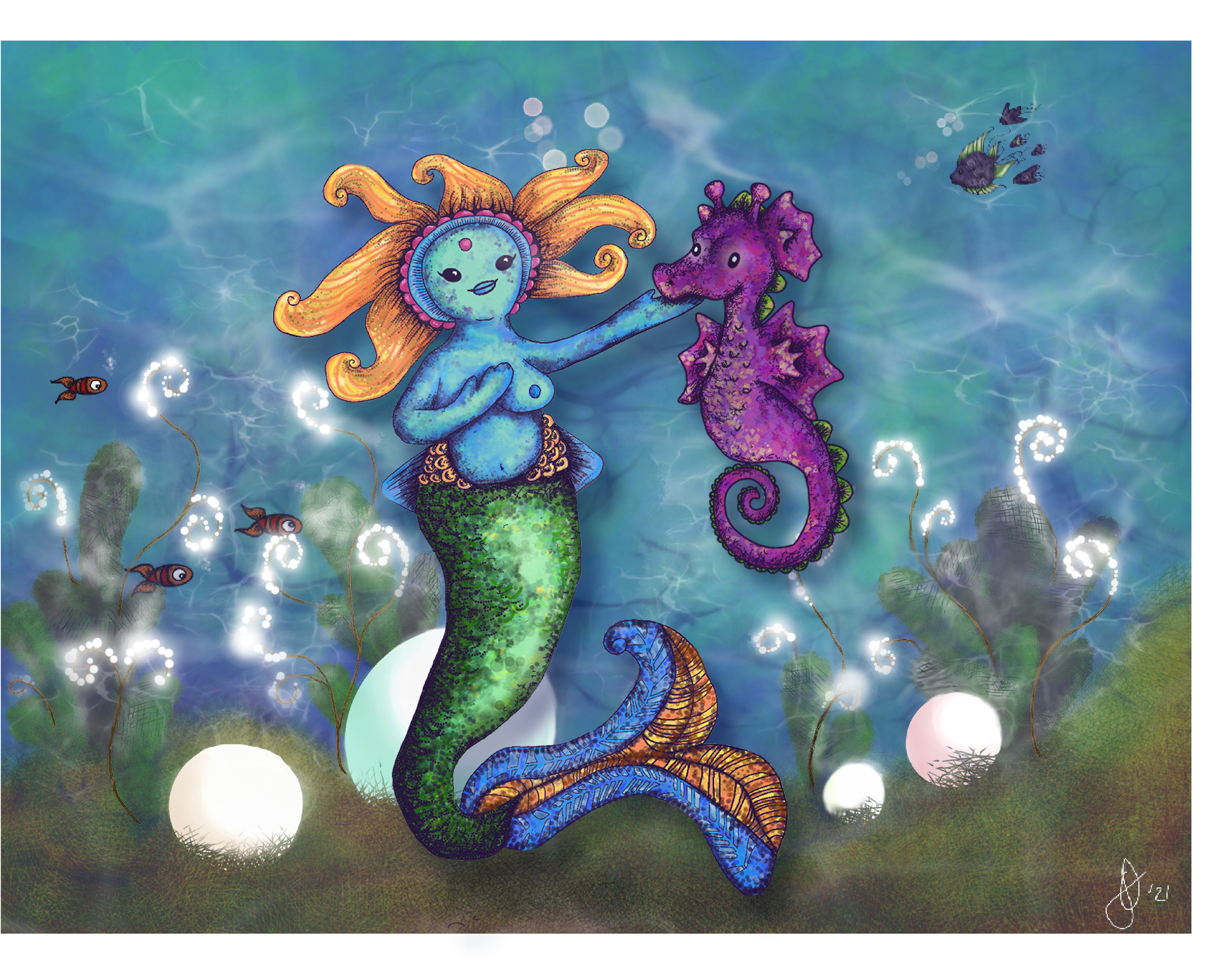
Reworked Landscape/Character
While I was very happy with the results on the computer screen, when I printed it, it came out very dark and oversaturated. There were also just a few tweaks I wanted to make. I lightened the background quite a bit, and removed the luminescent scatter and pearl glow, as I felt they were too wonky, and added too much to the visual effect, drawing attention away from the subject. I did this with a clipping mask, then feather effect. I added some Gaussian blur to the fish on the left side, as I had forgotten to do that previously, and I ended up taking out the seaweed entirely - again, because I felt it was just a bit too much. I added a blue-green drop shadow to the two characters, and enlarged them, ensuring that they would be foremost in the frame. I played with adding some other, smaller, plants, but ended up leaving those out.
While it isn’t as color-rich as the original, I feel like it allows the characters to be seen, and not lost in all of the background color and detail. The soft, watery feel of the background contrasts better with the saturated colors and higher contrast of the mermaid and seahorse, and will hopefully allow me to print it in a way that is visually appealing.
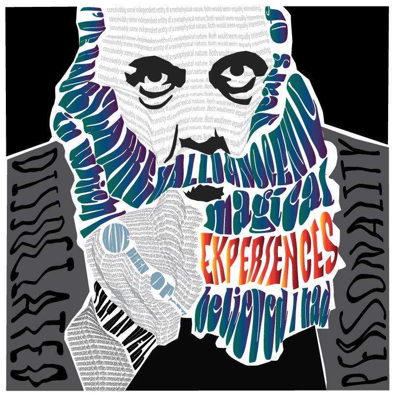
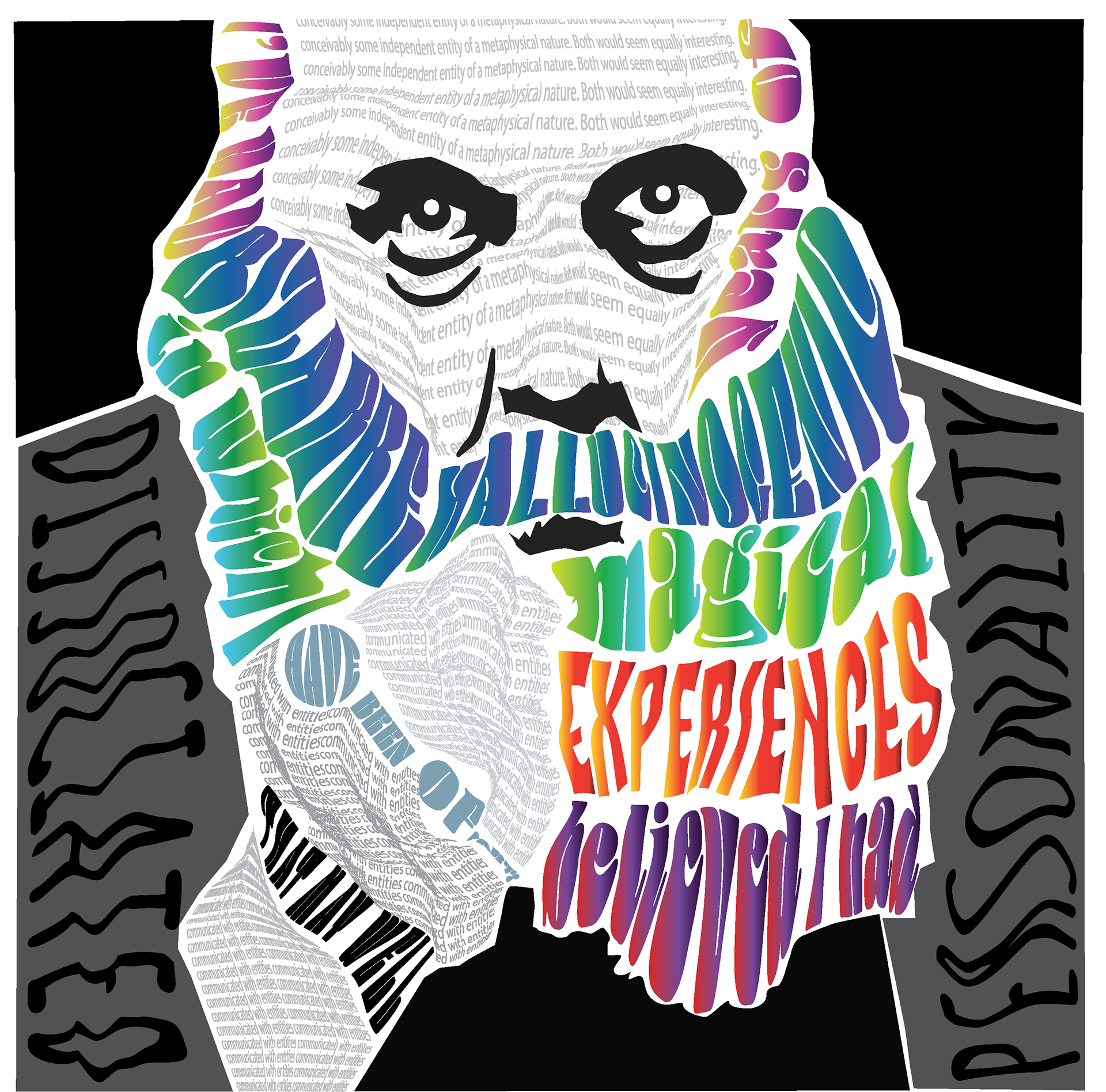
Typography portrait project for Digital Illustration I
Reworked portrait
I did like this project very much, but if I remember correctly, I had to hurry the completion a little, and there were definitely some areas that I wanted to refine. I took advantage of the ability to rework it by amping up the colors in his beard, making each segment a different color gradient, playing on the hallucinogenic and magical elements. I adjusted the envelope mesh on his face, adding some dimension to his nose and brow areas, and went through all of the beard letters to make sure none were touching, and more evenly space from the other elements. I refined the black shape of his shirt under the beard to better travel with the text, and made some adjustments to his jacket, where it was touching other shapes. I lightened the color of his fingers, made his mouth a little less agape, and added shine to his eyes. I really like this edit so much more!